wbTeamPro Feature Request & Bug Tracker - wbTeamPro |
| View Issue Details |
|
| ID | Project | Category | View Status | Date Submitted | Last Update |
| 0010890 | wbTeamPro | [All Projects] Features | public | 2017-01-30 09:31 | 2022-02-08 00:21 |
|
| Reporter | seandnz | |
| Assigned To | webuddha | |
| Priority | normal | Severity | feature | Reproducibility | N/A |
| Status | Planned | Resolution | open | |
| Platform | | OS | | OS Version | |
| Product Version | v3.8.x | |
| Target Version | | Applied to Version | | |
|
| Summary | 0010890: Improve Dashboard UI |
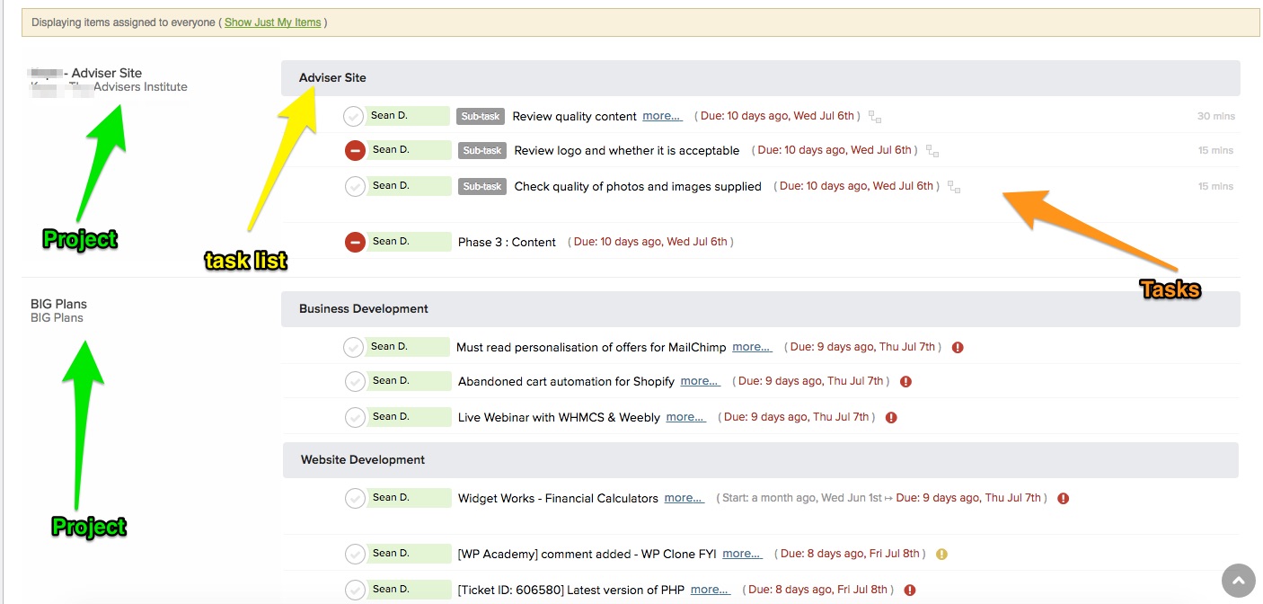
| Description | It would be great if we could have a better view on our Dashboard so we can see more data with less wasted space. In my experience and opinion, each task on the dashboard takes up 3 lines which is a lot of viewing real estate. I'd love to see the grouping of a project first, then task list, then task. We have just moved from another provider to wbTeamPro and I have attached what I guess we are used to, but you got to admit it is very easy to see more using the same viewing area. I have attached a couple of screenshots to show you what I mean, thanks. |
| Steps To Reproduce | |
| Additional Information | |
| Tags | No tags attached. |
| Relationships | |
| Attached Files |  Dashboard_-_BIG_Plans.jpg (171,347) 2016-07-15 18:22 Dashboard_-_BIG_Plans.jpg (171,347) 2016-07-15 18:22
https://tracker.holodyn.com/file_download.php?file_id=57&type=bug
|
|
| Issue History |
| Date Modified | Username | Field | Change |
| 2016-07-15 18:22 | seandnz | New Issue | |
| 2016-07-15 18:22 | seandnz | File Added: Dashboard_-_BIG_Plans.jpg | |
| 2016-07-15 18:22 | seandnz | | |
| 2016-07-20 10:32 | webuddha | Assigned To | => webuddha |
| 2016-07-20 10:32 | webuddha | Status | New => Planned |
| 2018-01-23 02:29 | ourwebmedia | | |
| 2018-01-23 02:30 | ourwebmedia | Note Added: 0010327 | |
| 2018-06-26 12:41 | seandnz | Note Added: 0010333 | |
| 2022-02-08 00:21 | aldingamedia | | |